Climate Emergency Fund is a safe bridge between funders and activists at the cutting edge of the climate movement.
Climate Emergency Fund’s visual identity is bold and simple. It doesn’t shy away from the urgency of our situation—instead it shines out as a beacon of hope in times of crises.
The identity solidifies the organization’s clarity of message around the climate and ecological emergency, as well as its clear theory of change around how to tackle it effectively.


The message that Climate Emergency Fund brings is as suited to a board room as an activist banner, because it is true. The typography draws on protest history and culture while communicating that Climate Emergency Fund is a professional institution who are evidence-led and an effective investment for funders.
The Climate Crisis is the biggest challenge humanity has ever faced—we communicate this with clarity, urgency and without losing focus.
Climate Emergency Fund’s visual identity echoes the organization’s unique position in exclusively funding disruptive climate activism through custom-made typography and illustrations whilst avoiding off-the-shelf solutions or AI generated templates.
It speaks to funders through straightforward, clear visuals—and to grantees through its roots in protest culture.

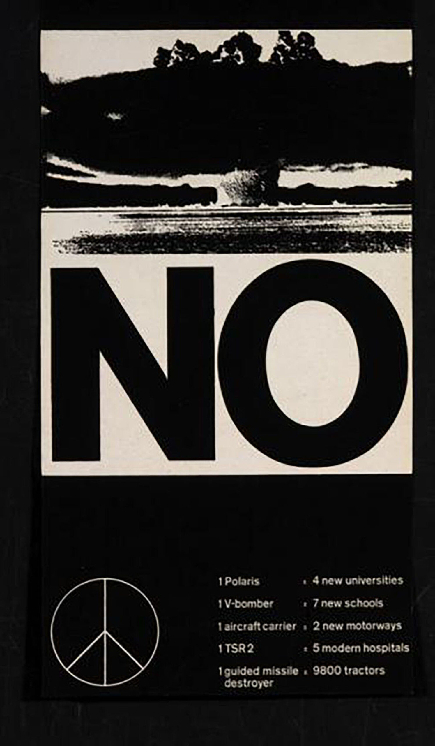
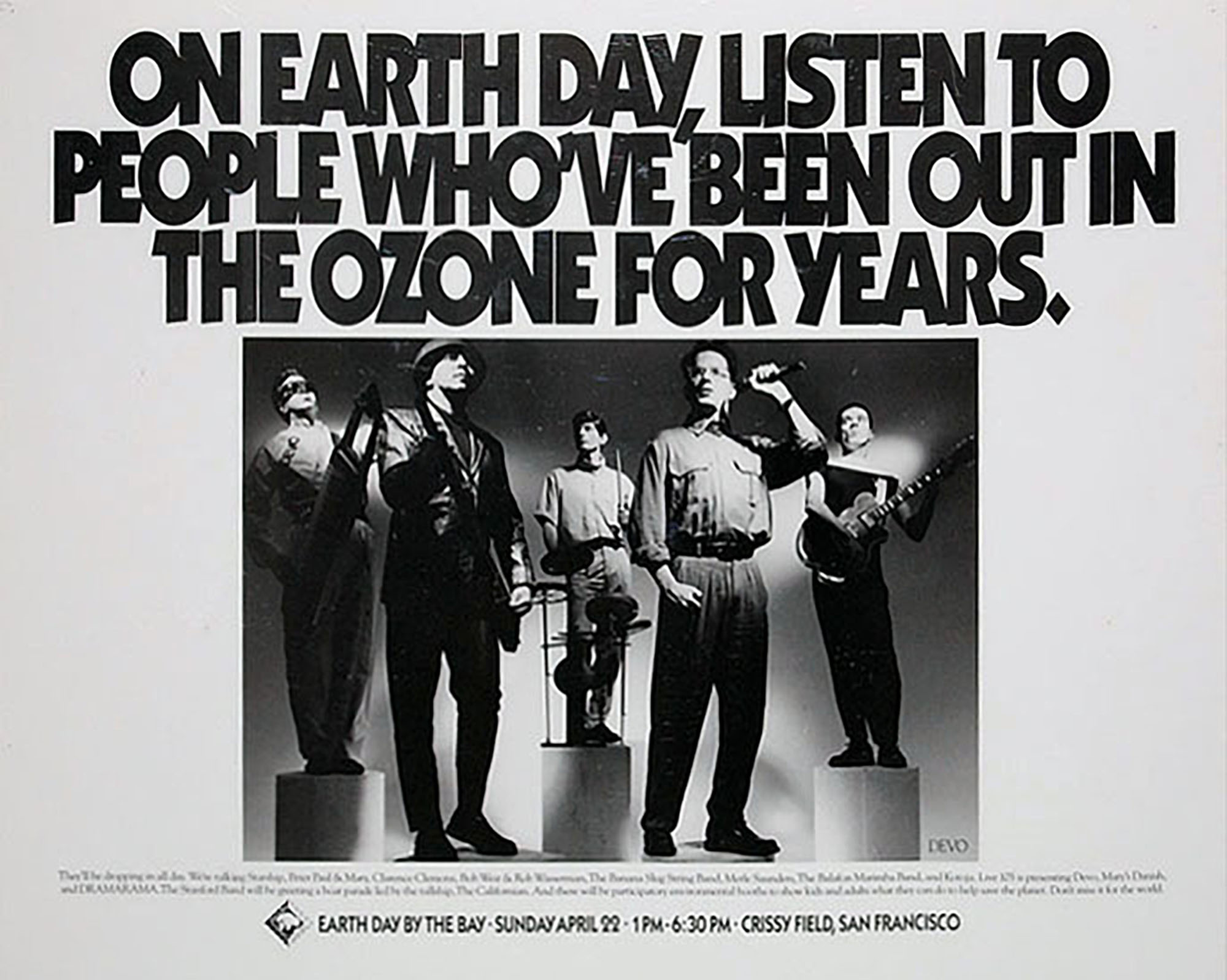
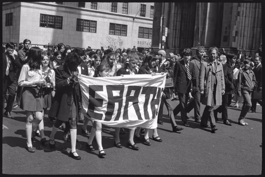
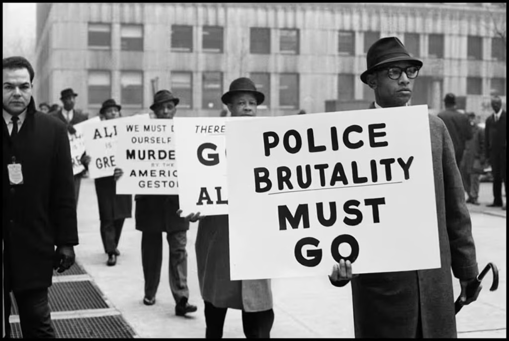
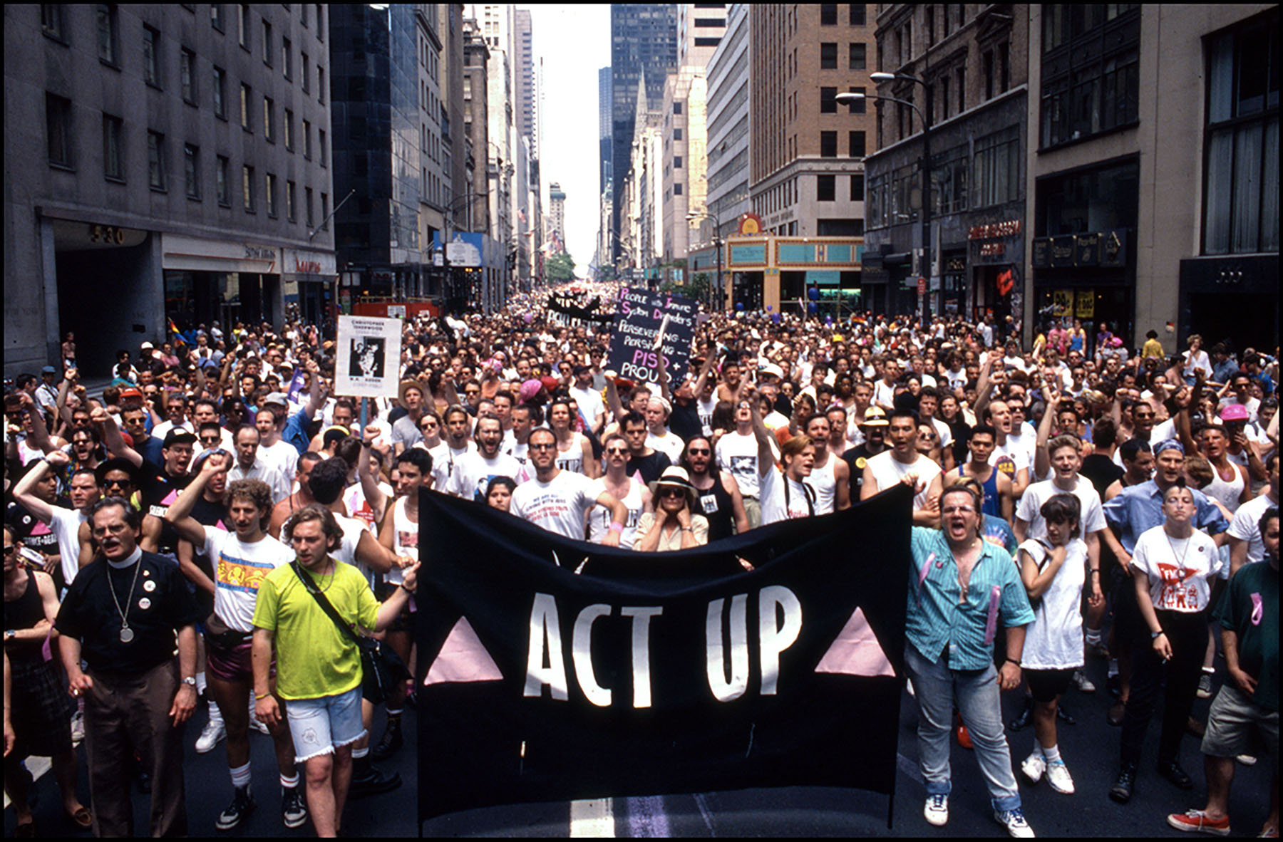
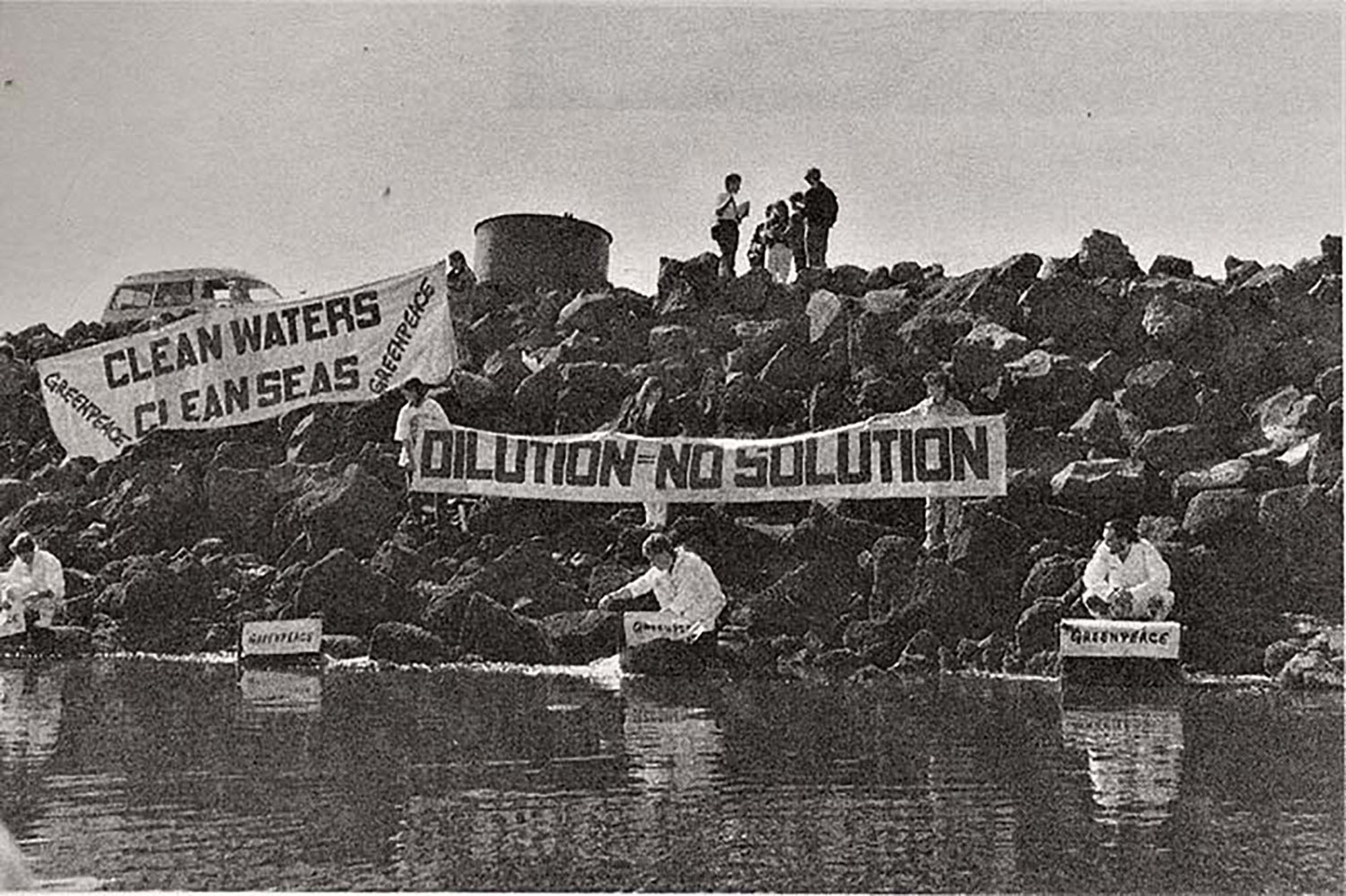
Making History by looking back at History
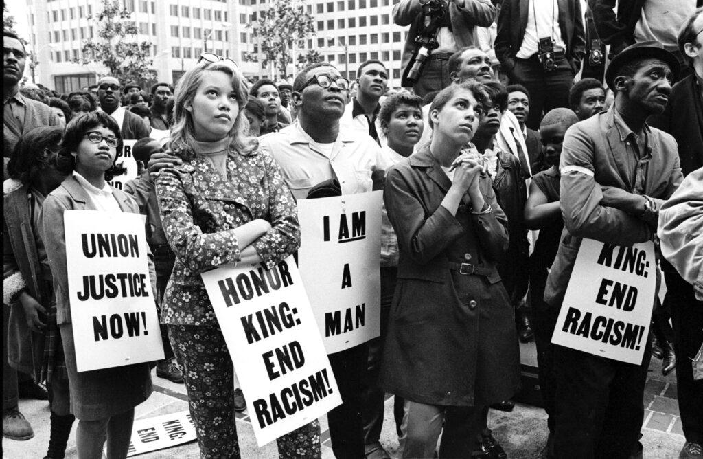
The visual context for this identity began by looking at how other major crises have been protested throughout history: the civil rights movement, the anti war movement, and the beginnings of the environmental movement.
These radical histories are the foundations from which the movement Climate Emergency Fund supports has flourished. This story of activism is a subtle reference in the identity told through the typography.